The Doughspot brand identity
A brand identity for a new bakery. This identity required a bright, funky, friendly style.
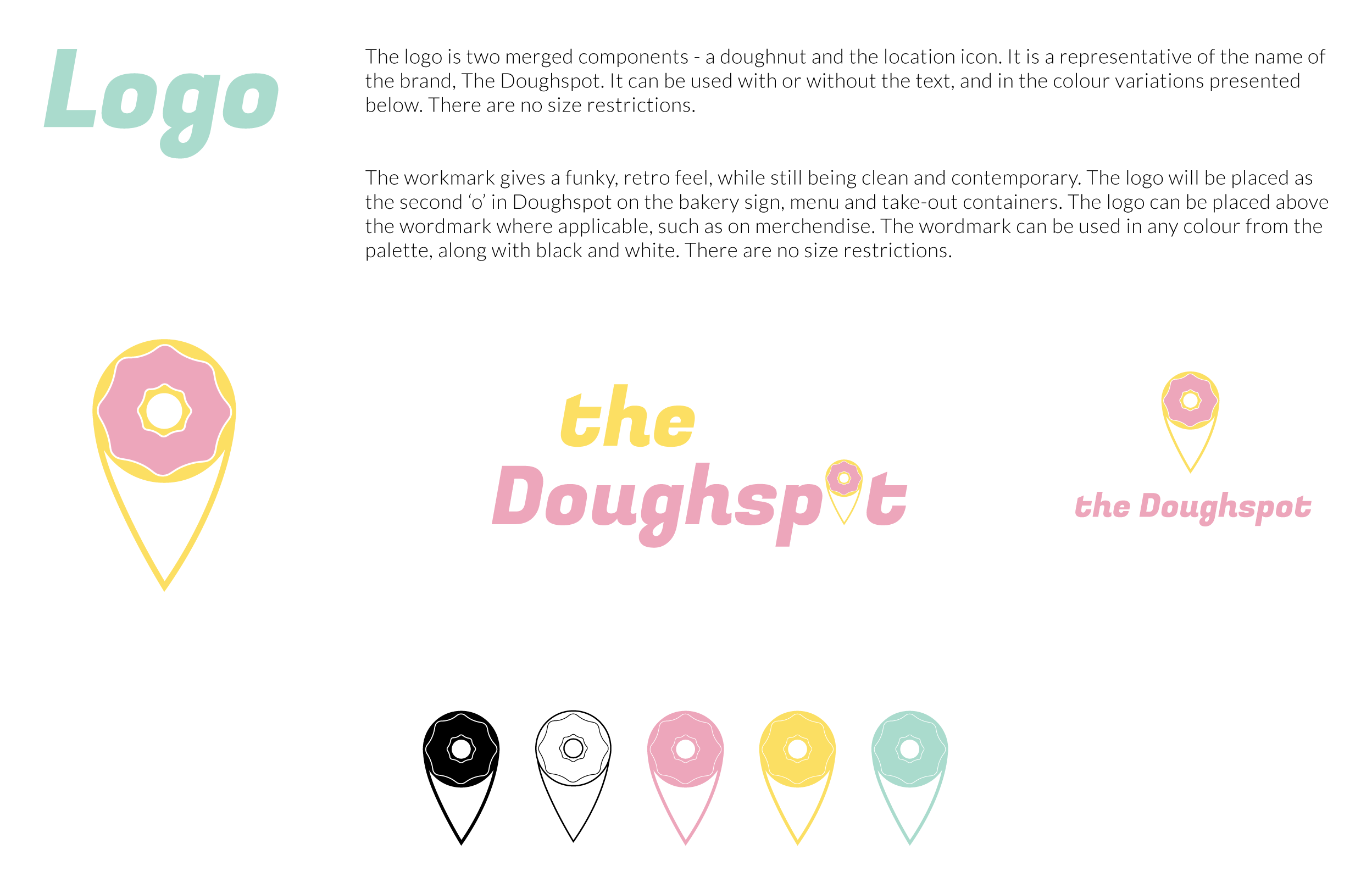
The logo is a play on the brand’s name, a doughnut and the location icon.
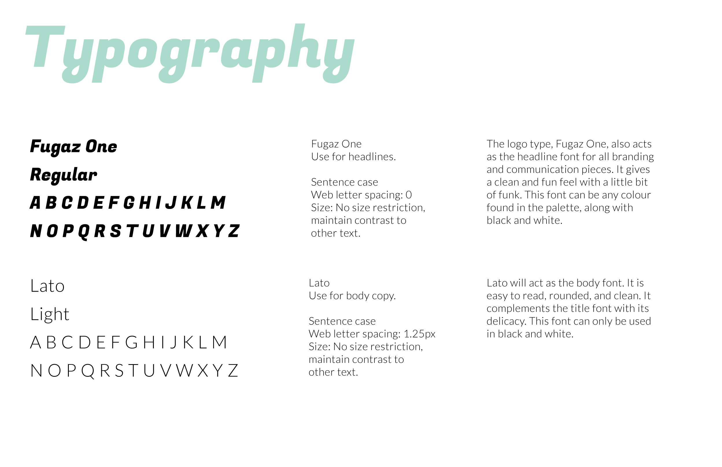
The bubbly letterforms and interior design give it a funky 50s/60s atmosphere, while the bright colours, digital elements, and food keep the brand fresh and fun.


