
Super Cards
Super Cards is a modular email system that allows designers to use different styles of images to create engaging emails and better convey messages.
Our client came to us with the desire to update and streamline their current card-style email modules. The card modules in different lines of business (for example: consumer, membership, earner, and business) had different copy length allowances, different call to action buttons, different sized images, and different padding. These differences caused a disjointed feeling between the company’s different lines of business.
Step 1
Our first step was to solidify the module’s padding, image sizing, and copy character count. We received some exploration and guidance from the client that we compared with our current modules and best-practice guidelines. Here is some of the comparison research.

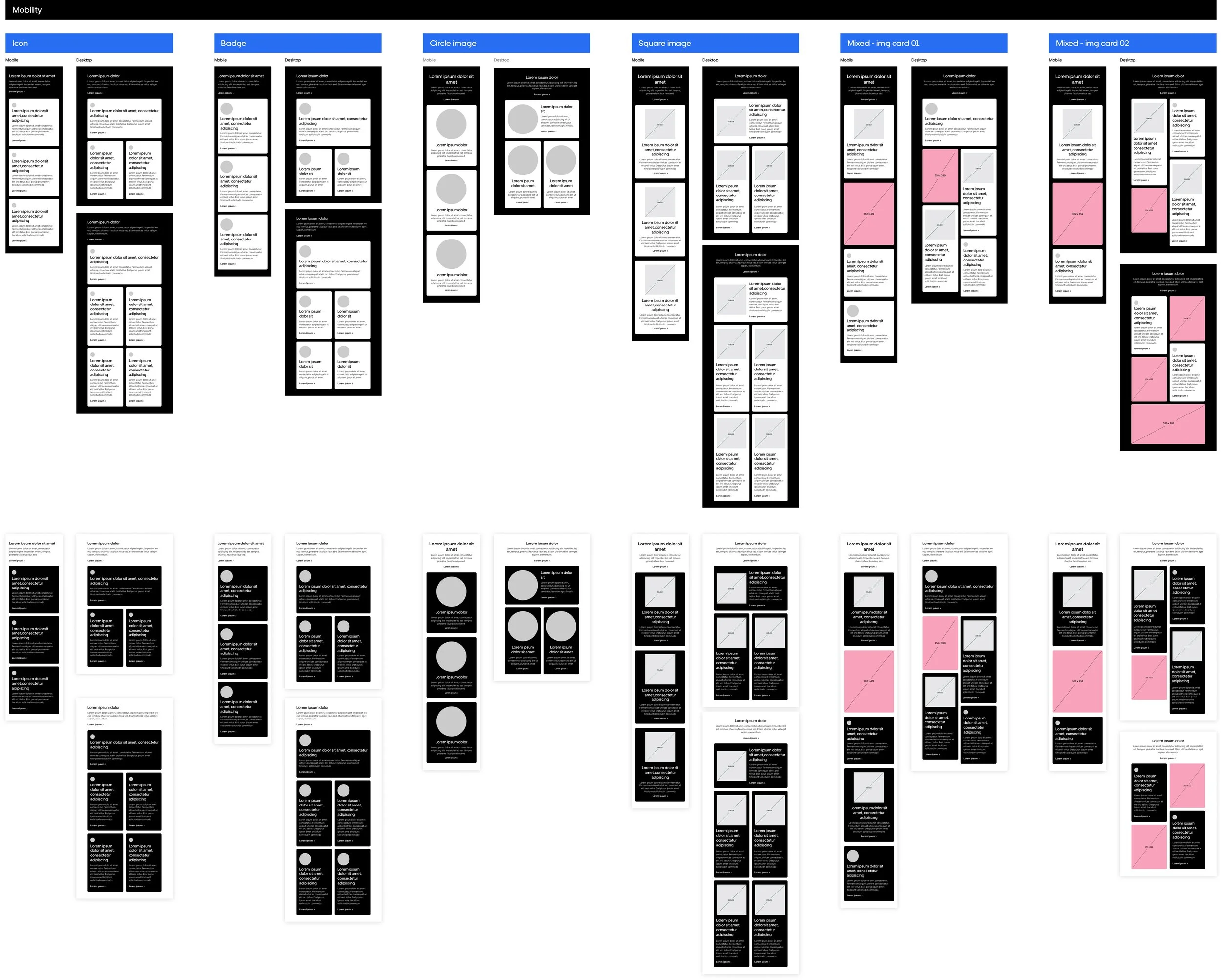
Step 2
We then began to build initial wireframes. We created versions of mobile width, desktop half width, and desktop full width cards. All sizes were built with small icons, large icons, circle images, square images, and full card images. To make this step and next one easier, we created a small component library with each of the cards so we could quickly make each iteration of the module by changing the card variant.
Step 3
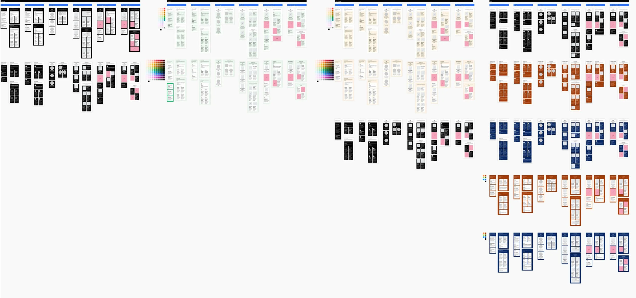
Once we were happy with the initial wireframes, we added the accessible colours for the other lines of business (consumer, membership, and business). Our client likes to see all possible options to make sure that everything works. At this point, we sent the templates to the client to review.
Step 4
Our client’s feedback was to provide every colour option within each line of business. The colour library has over 900 colours, which means we had to create each module version (small icon, large icon, square image, circle image, and mixed layout) with each colour as the module background, and each colour as the card background. After this, we sent it back to the client to review.
I am unfortunately unable to show an image of this step as it would be far too large for a webpage. Please reach out if you’re interested in seeing the colour rollout!
Step 5
The client’s feedback was for only accessible colour to be allowed (hallelujah). This meant that we were able to remove many versions from the previous step. They also wanted to add two more image sizes, a large circle and a large square.
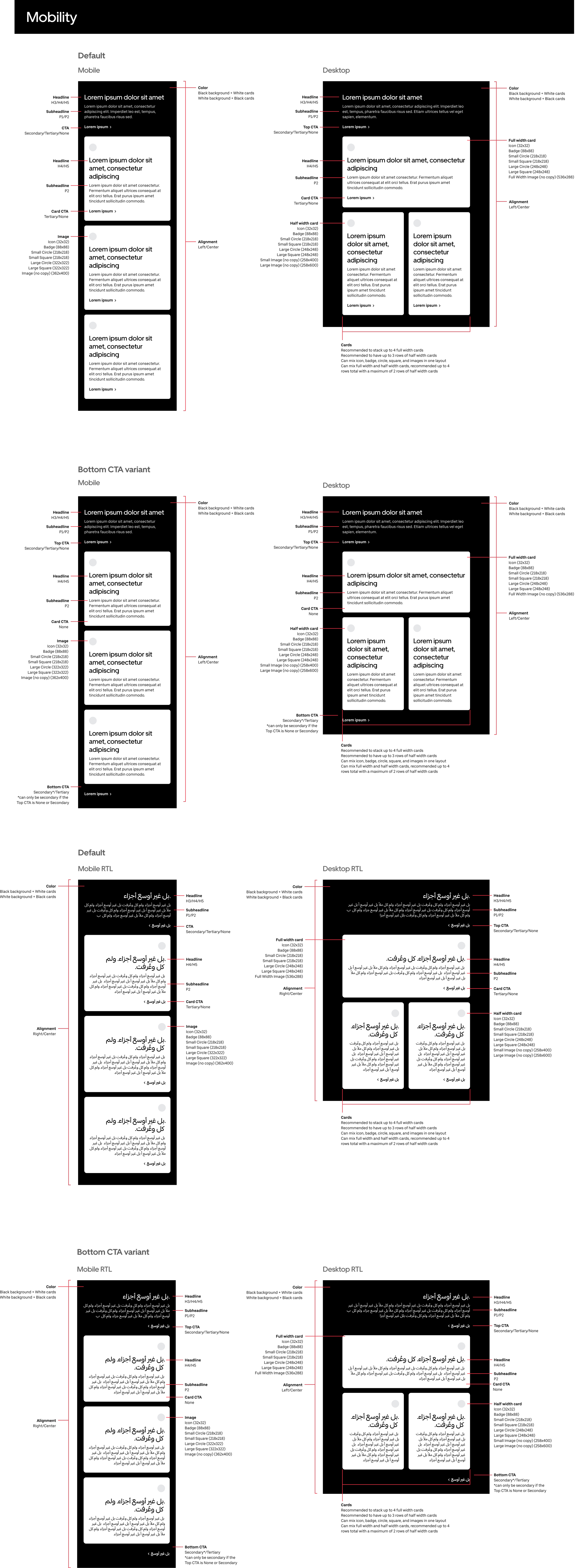
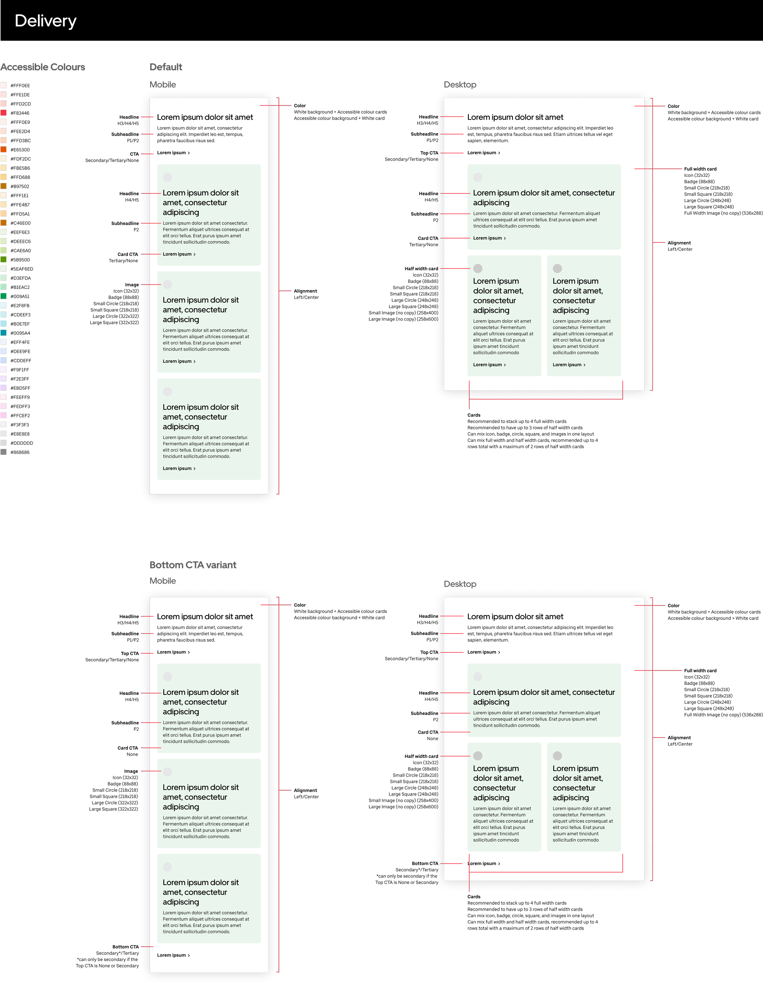
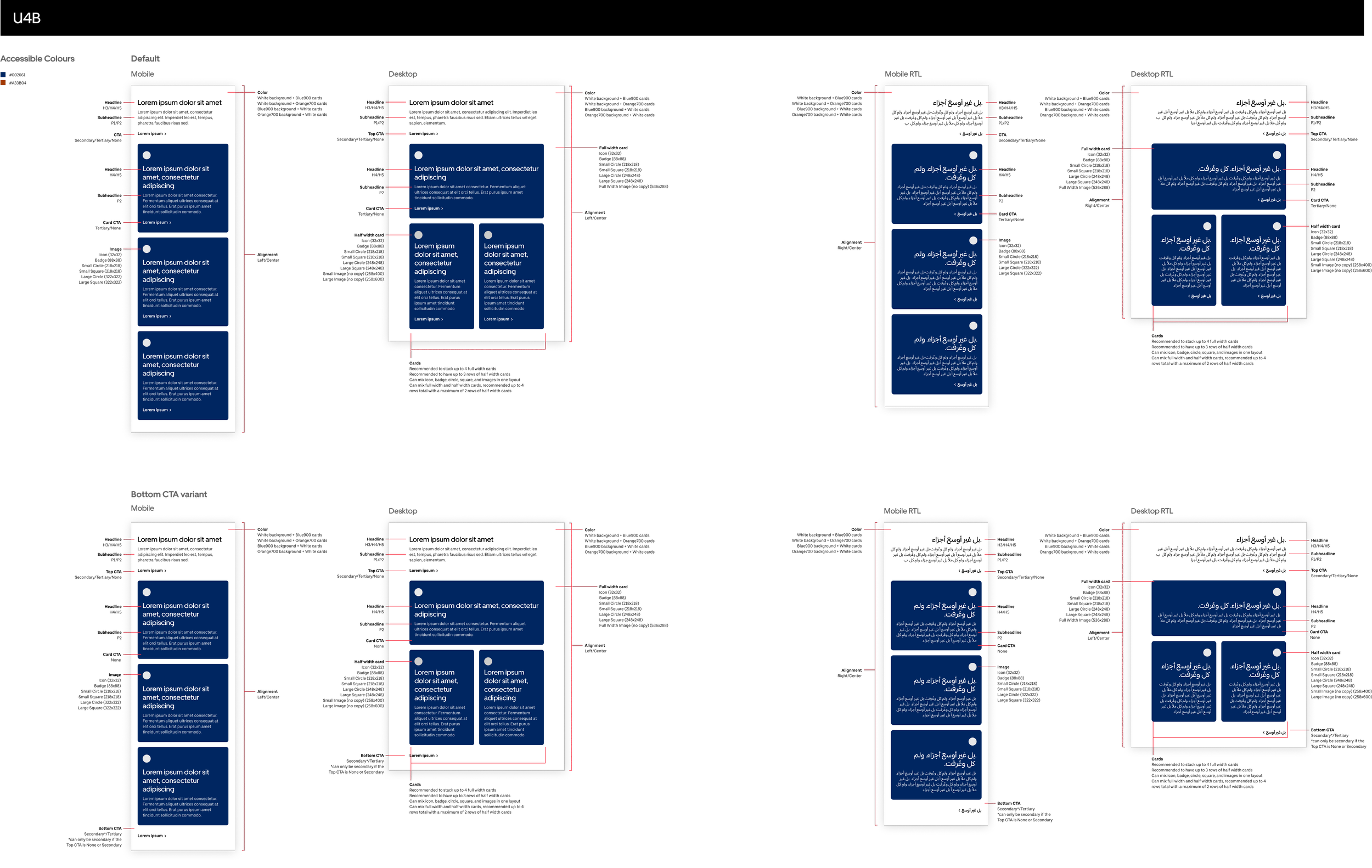
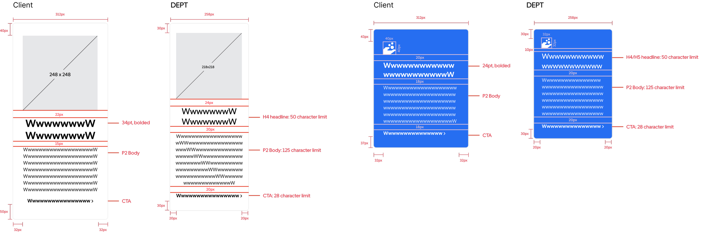
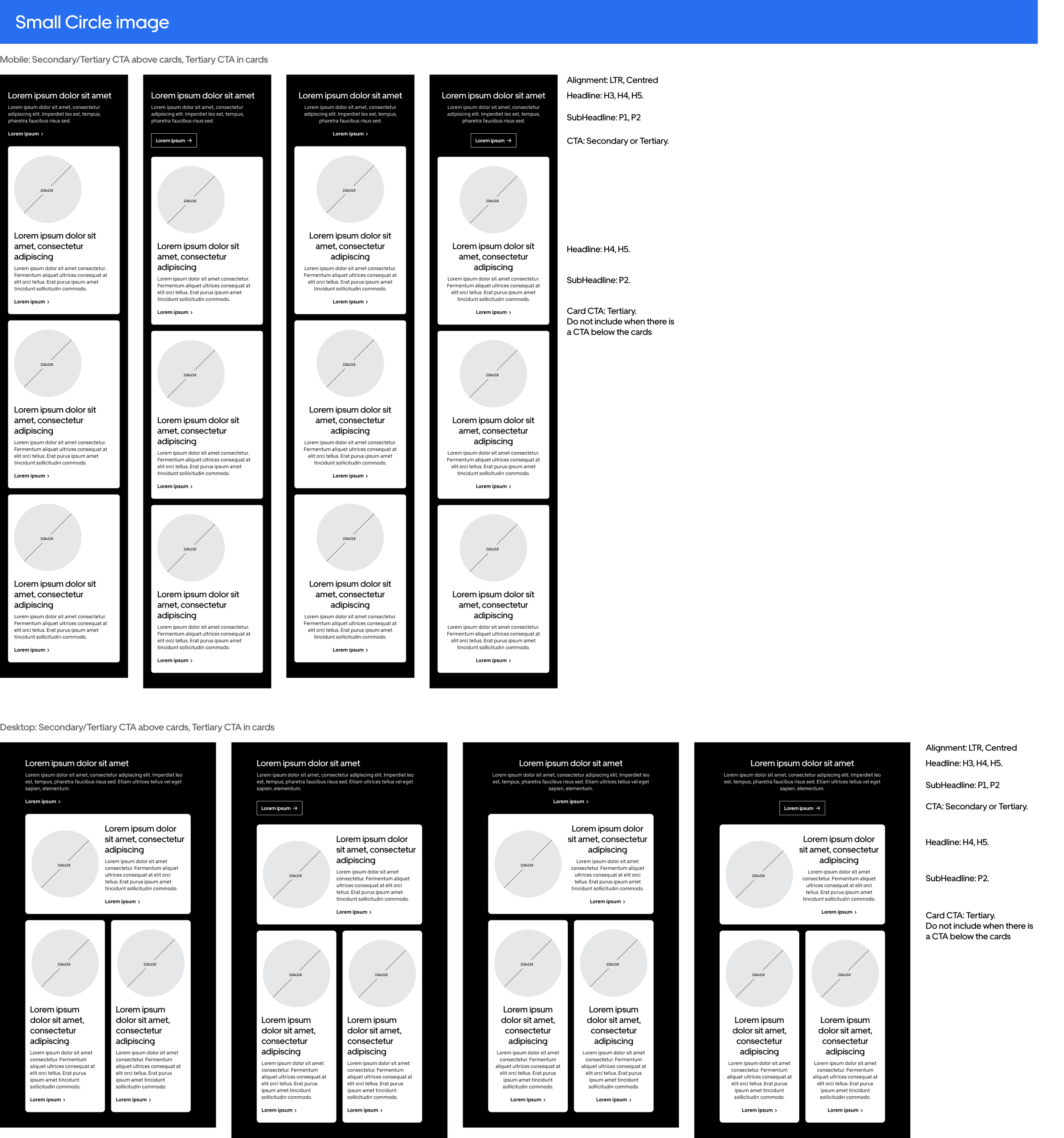
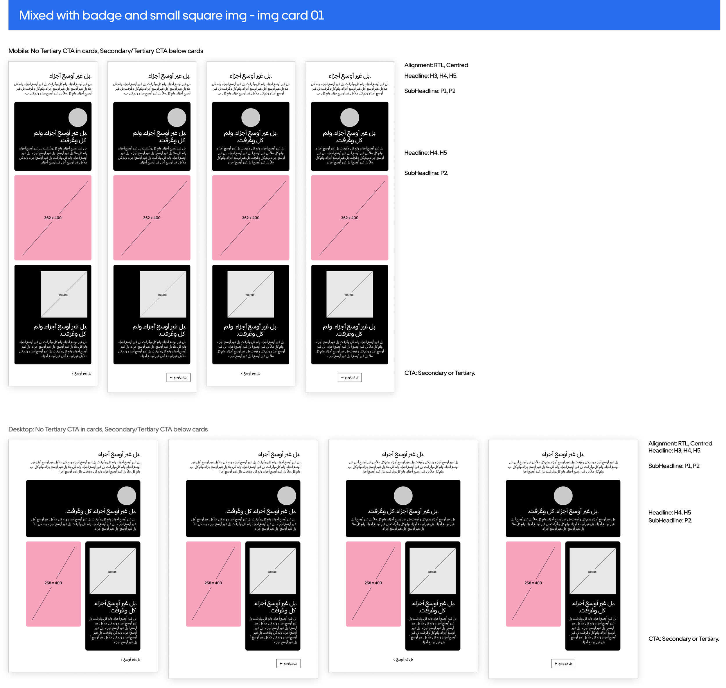
At this stage, we made a new small component library with updated specs to streamline the process of creating every version. We did this to make sure all the cards work and look good together. We also used this step to iron out little details, such as making the small image size 218x218px instead of 248x248px. We also wrote out the rules and details for each card and module, such as what size text is allowed and what call to action button style we can use. In total, we created over 250 versions of the module to show the different possibilities with the seven different image options. We also built each module with left-to-right text and right-to-left text in both black and white.
Below is a small example of the development and design rules we wrote for the module.
Step 6
At this stage our client approved the module for development!
We wanted to reduce the content we would be sending to the development team to make it easier for them to understand. We were able to reduce the module from 250+ to 28, and wrote more extensive notes and rules as to what each module allows. We, again, built a new set of components that will be transferred to our existing component library as soon as these modules are available for the designers to use.
I enjoyed going through this design process. It allowed me to be extremely detail oriented, and gave me an opportunity to apply my UX/UI design process and organization to a different medium.