Mosaic redesign
Mosaic - Photo & Story Editor is built with influencers and creators in mind. The goal of the app is to help young content creators on their daily creation journey.
The team at Mosaic - Photo & Story Editor app were looking to add preset and photo editing features to their existing template application.
The redesign includes new brand colours, a sleek new feel, and updated interfaces, interactions, and graphics.
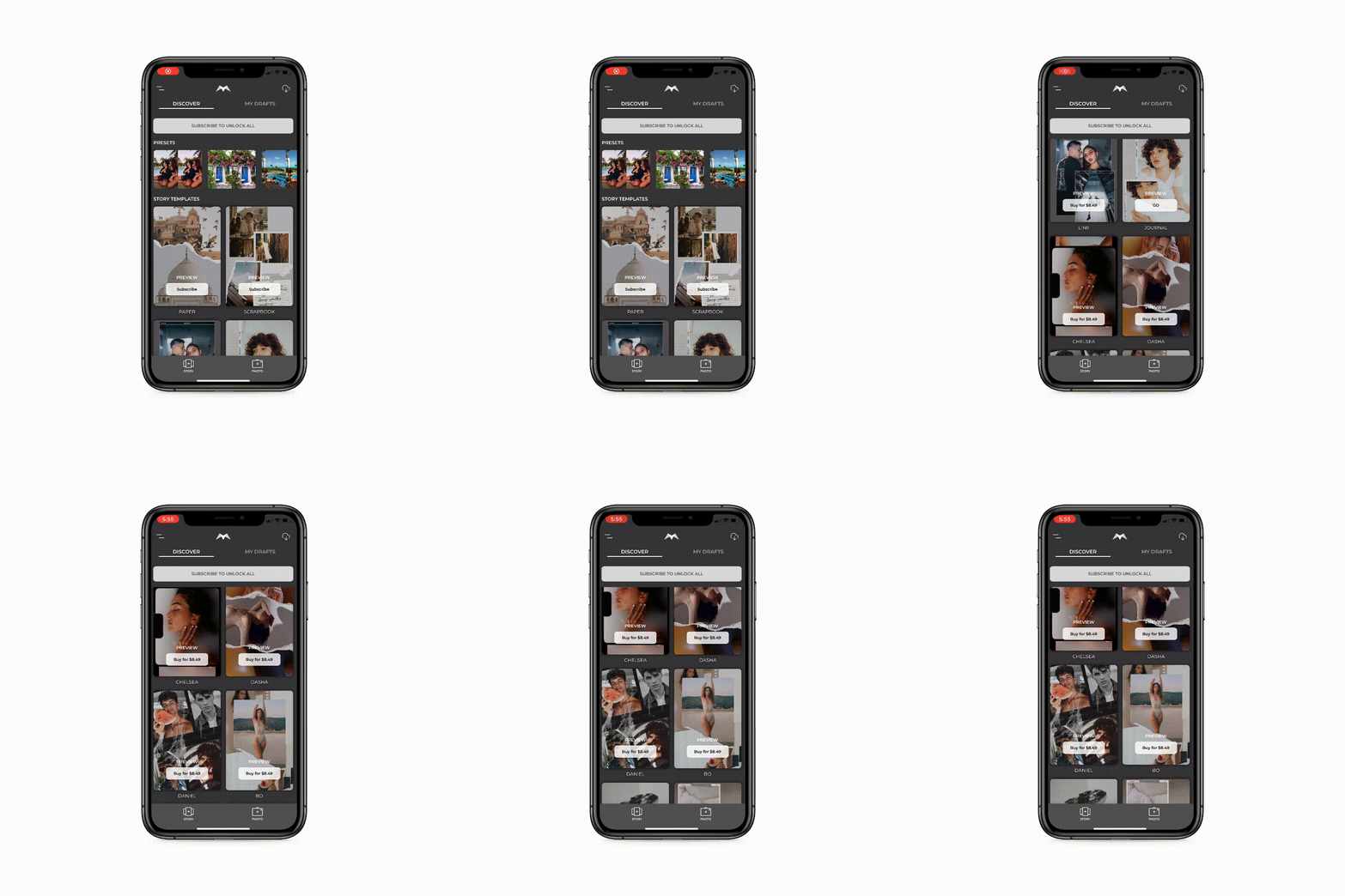
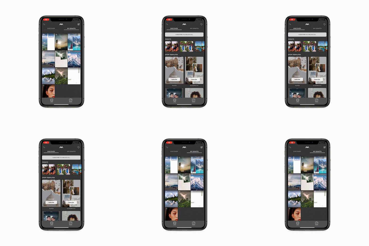
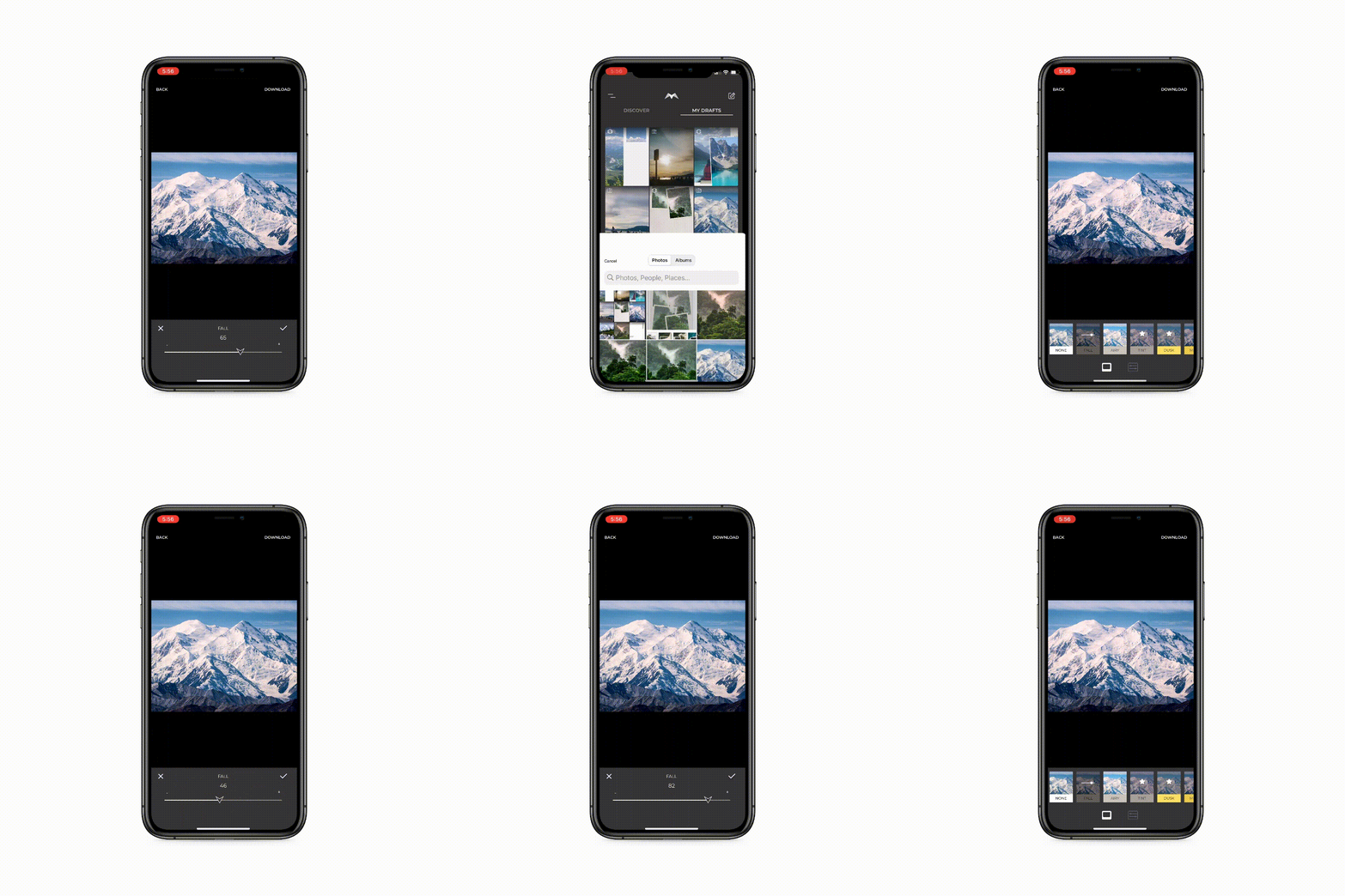
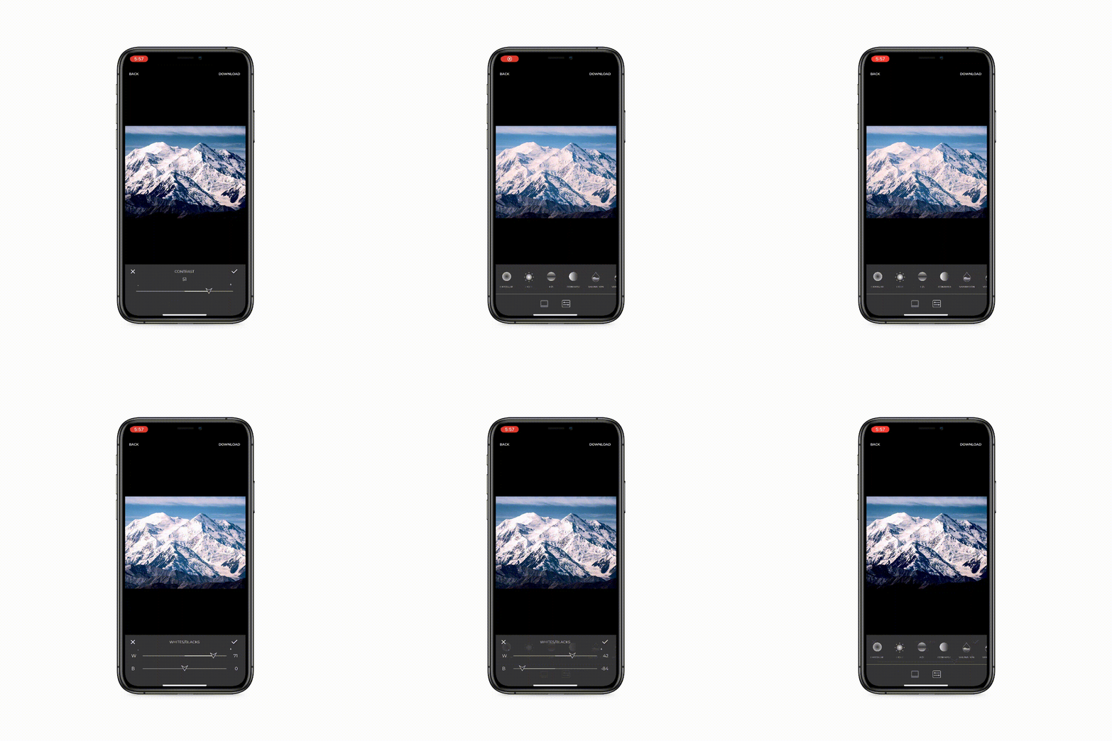
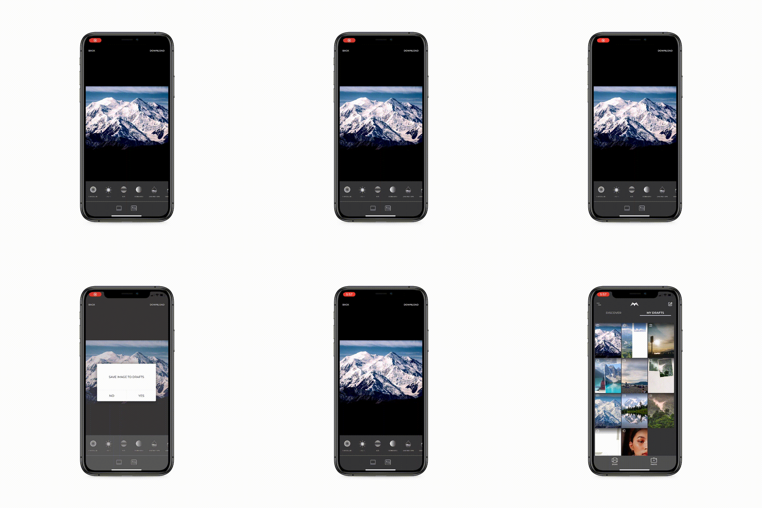
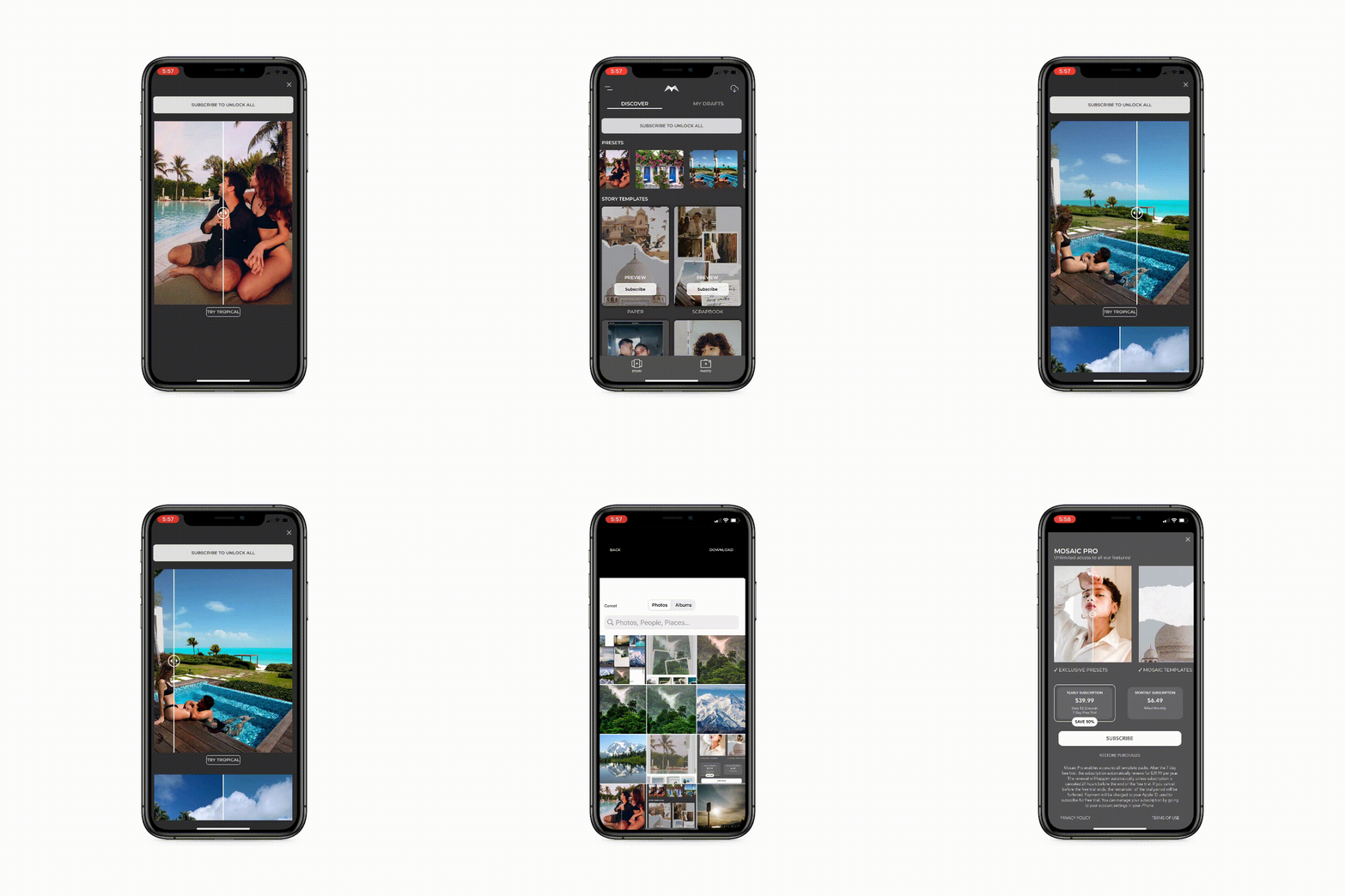
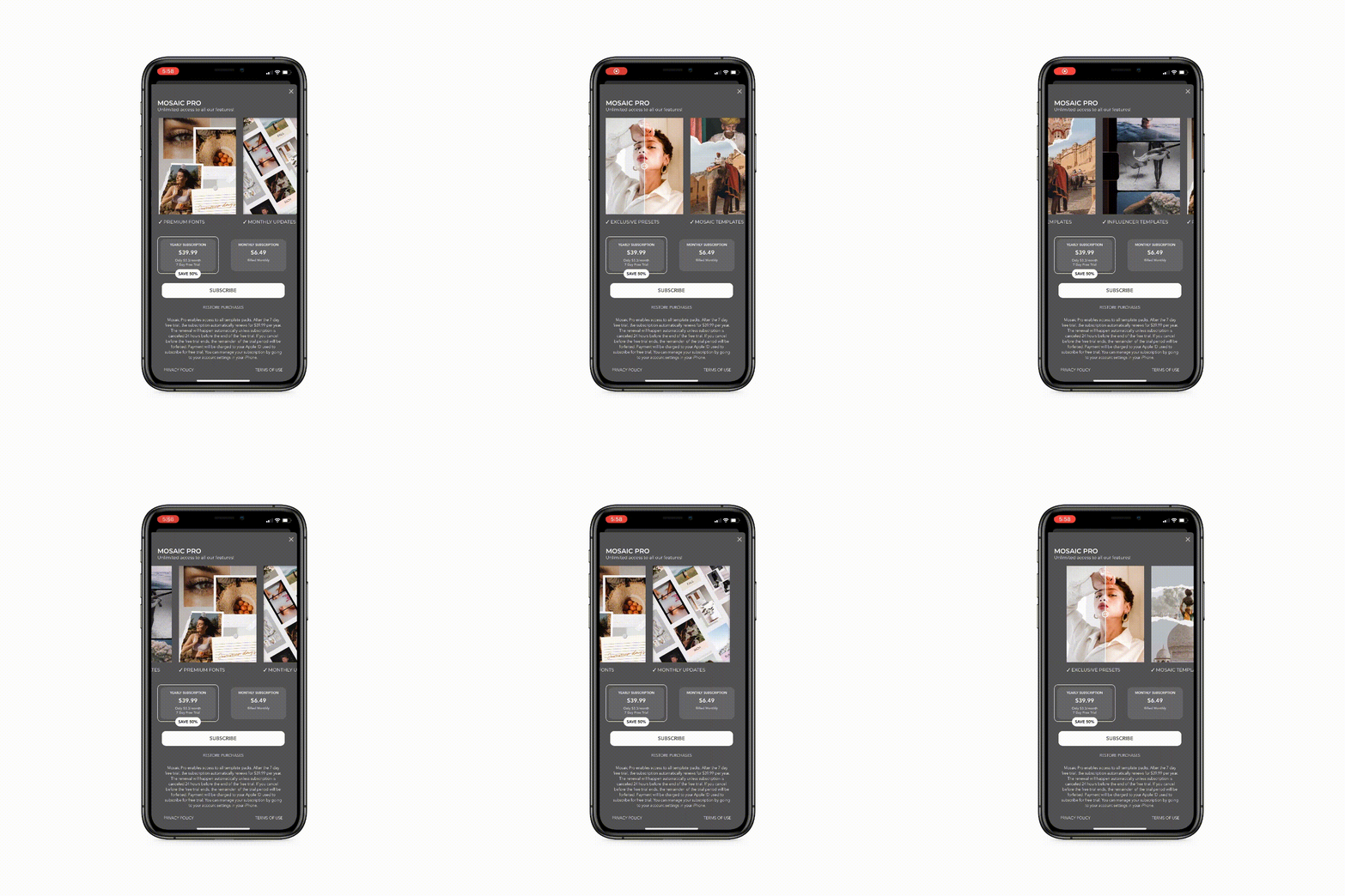
The Mosaic redesign began by looking at major competitors, such as Tezza and Unfold. This market research allowed us to dig deeper into what major things needed to change about Mosaic’s interactions and features. It was very important that Mosaic be ergonomic and intuitive to use. Minimizing boundaries allows for users to create more content quicker, saving them valuable time. The look and feel of the app was at the forefront of our design decisions. No detail was spared, from the draft page icons indicating a story template or edited photo, to the redesigned photo editing icons that further cement the sleek, cool design language.
To see more interactions and interfaces, download the app from the Apple App Store.


